


Condé Nast - Platform as a system
Scaling quality across a global publishing platform.
Turning a fragmented set of editorial tools into a connected system that shapes content, experience, and business outcomes for some of the world’s biggest brands.
OverviewCondé Nast operates at global scale, with 25 brands, 60 sites, and over 4,000 editors working across more than 20 markets.
At this level, the challenge wasn’t simply scale, but coherence.
The platform supported the full content lifecycle, from planning through to publishing and experience. In practice, however, it operated as a collection of disconnected tools owned by different teams, each with their own standards and ways of working.
This meant the platform enabled content production, but it didn’t shape the quality, consistency, or performance of what was produced. It needed to operate as a connected system.
The approachThe work centred on three connected areas: simplifying platform complexity, scaling delivery through shared systems, and defining the role of the front-end experience within the broader ecosystem.
These were not isolated workstreams, but interdependent parts of a single shift from a fragmented toolset to a platform that could operate as a system.

Connecting the content lifecycle

Defining where to standardise

Enabling flexibility where it created value
The realityThe platform worked in parts, but not as a system.
Planning, creation, rendering, distribution, and front-end experience were handled separately, across different tools and teams, with no shared structure or consistent standards.
As a result, teams were often solving the same problems repeatedly. Experiences varied significantly between brands and markets, and quality was inconsistent because nothing was enforcing it.
The platform enabled output, but it didn’t shape it.
The tension
The challenge wasn’t the tools. It was the tension between competing needs.
Editorial teams needed flexibility to tell distinctive stories. Engineering required consistency in order to scale effectively. Commercial teams depended on predictable surfaces to support monetisation.
These needs don’t naturally align. If everything remains flexible, the system fragments. If everything is standardised, brand value is lost.
The problem was not choosing one over the other, but defining where to draw the line.
The decisionI made a deliberate shift in how the platform was defined.
Instead of treating it as a collection of tools, I redefined it as a structured system supporting the full content lifecycle. This established a clear model across planning, creation, rendering, distribution, and experience.
From there, I defined where standardisation was non-negotiable, focusing on structure, performance, and core building blocks. Alongside this, I defined where flexibility remained, allowing editorial teams to create value without breaking the system.
The outcome was not a reduction in capability, but a clearer framework for how the platform operated.
Treating the platform as a system of systems, not just a collection of tools.
The platform was restructured as a system of systems, connecting planning, creation, syndication, and experience into a continuous workflow.
Instead of tools handing off to each other, content flowed through a unified system from planning through to user experience.
This reduced duplication across teams and markets and created a more consistent foundation for both content and experience.
This connected the CMS, design system, planning, and syndication tools into a single operating model, rather than separate products.
Content could now be created once and scaled globally, rather than recreated across markets.
Content reuseCreate once, scale globally.
One of the biggest unlocks of this effort was being able to treat content as something that flows through the system, not something that gets recreated each time.
Editors can now create a single piece of content, then syndicate across multiple markets and languages.

A good example of this was for Vogue, where a single story was reused across 9 different markets in 5 languages, generating a combined 7.3million Unique Page Visits.
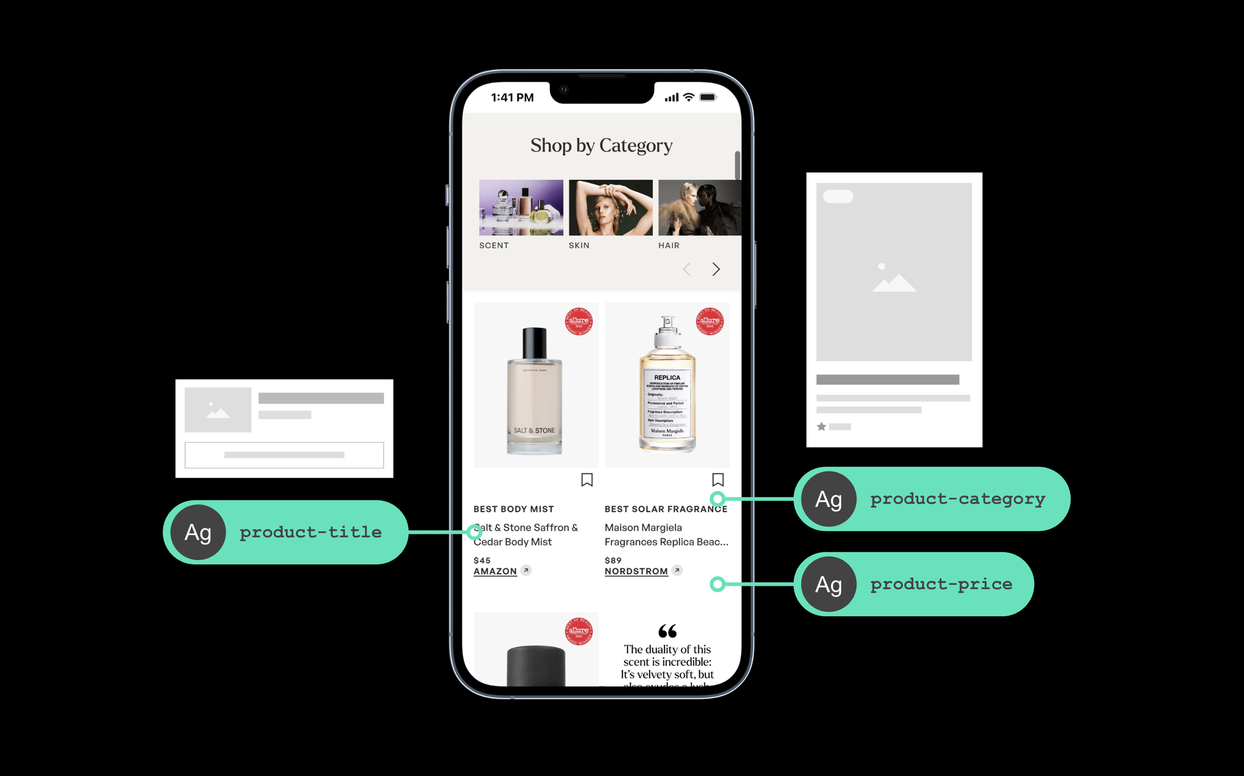
Experience controlControlling quality without removing flexibility.
The front-end needed to scale quality without making every experience the same.
I broke the page down into layers, identifying where structure and behaviour needed to be standardised, and where expression could remain flexible.
This allowed brands to shape distinctive experiences while maintaining consistency in the underlying system, ensuring that quality could scale without flattening identity.
The system only worked because it was actively governed.
Clear governance was introduced to ensure decisions were made consistently and for the right reasons. This included dedicated forums focused on decision-making rather than discussion, alongside clear standards for how the system evolved.
A key principle was reducing complexity, not adding to it. In one case, a heavily customised component with multiple variations and properties was removed entirely and replaced with a more flexible, composable system.
The approach was consistent: fewer, more capable building blocks, rather than an expanding set of components.
Tension in practiceMaintaining this balance required holding the line where necessary.
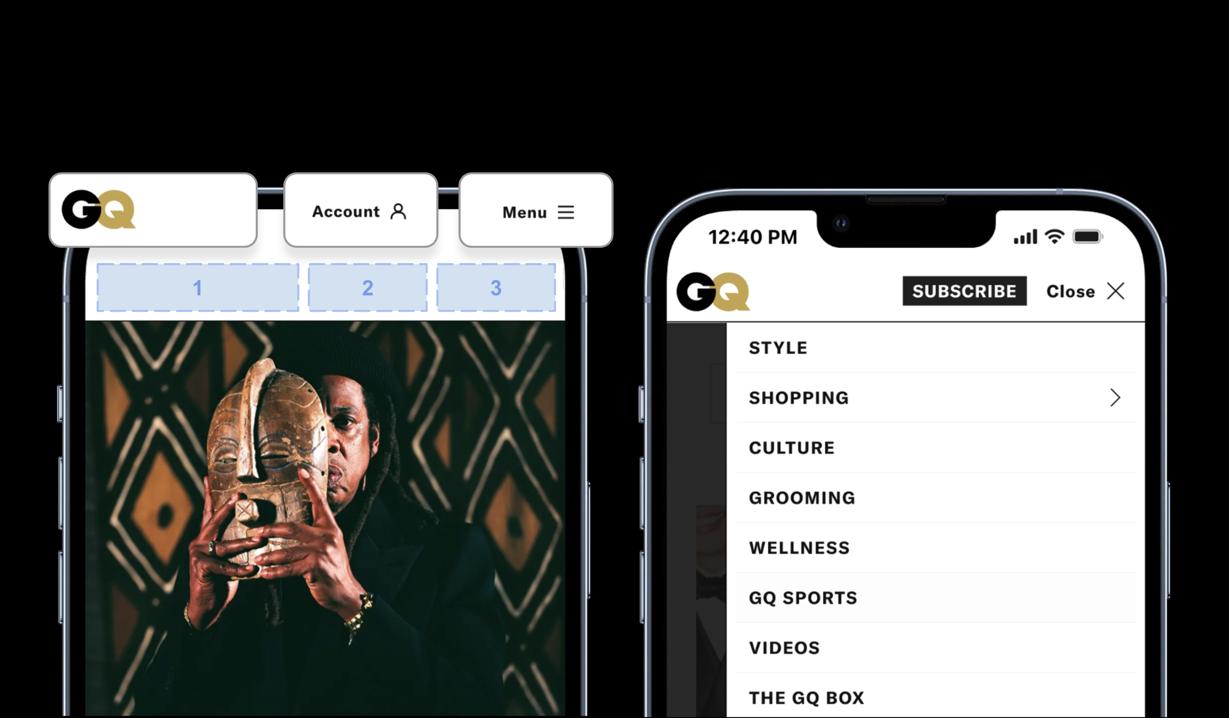
A clear example was our new global navigation. Several brands wanted to retain legacy structures and extend them. While reasonable in isolation, this would have limited the ability to scale a consistent system.
We also challenged the number of navigation items. Testing showed that beyond a certain point, increased choice reduced engagement due to decision fatigue.
These decisions required holding direction, even when there was pressure to diverge.
Build vs ExtendStrengthening the system, not expanding it.
There were cases where teams requested new components.
Instead of adding to the system, I prioritised strengthening what already existed.
For example, rather than introducing a new product card, we extended the existing component to support additional use cases.
This avoided increasing system complexity and ensured consistency across experiences.
The default wasn’t to add. It was to strengthen.
Regional adaptionWhere there was clear user and business value, the system adapted.

Supporting Arabic, for example, required right-to-left layouts, new typography, and changes to CMS workflows. These were not surface-level adjustments, but structural changes that affected how the system operated.
The principle was consistent: adapt where it creates meaningful value, not where it introduces unnecessary complexity.
Business valueAs the system took hold, the impact was both operational and commercial.
System errors reduced significantly as inconsistency was removed at the source, and teams no longer needed to recreate patterns and workflows across brands and markets. Decision-making became clearer, reducing friction and improving delivery efficiency across teams.
At the same time, performance improved across key metrics, including increases in time spent, faster page response times, and measurable uplift in commerce engagement.
These were not isolated improvements, but the result of system-level decisions shaping how the platform operated.
In terms of the business impact, we saw a 30% increase in time spent across flagship brands.
Performance improved significantly, with page response times becoming 84% faster.
And we saw a 5 - 15% uplift in commerce click-through rates, supported by more consistent templates and improved content structure.
These weren’t isolated improvements. They were the result of system-level decisions that changed how teams built and how users experienced the product.
+30% increase in time spent across flagship brands
84% faster page response times
5–15% uplift in commerce click-through rates
Leadership roleA platform that scales quality, not just capability.
This work went beyond connecting tools. It required aligning teams, redefining ownership, and establishing a shared way of working across a global organisation.
I led design through this shift, working across Product, Engineering, and Editorial leadership to maintain delivery while transforming how the platform operated.
The result was a platform that didn’t just enable content production but actively shaped the quality, consistency, and performance of experiences across markets.
It scaled not just technically, but as a driver of business outcomes.